Automyo
STARTUP KIT

SERVICES

  • Startup KIT
  • Website
  • Pitch and investor deck
  • Lead Generation
  • Brand Identity

TOOLS

  • WordPress
  • Illustrator
  • Photoshop
  • InDesign
  • Social Media
  • Hubspot
  • Google ADS- Analytics

THE CUSTOMER

Automyo is an innovative startup that works in the fields of automation for company processes. They’re main product is Claudio, an RPA which supports the internal workflow of teams, improving the company’s global efficiency and helping it save time on individual processes, often repetitive and burdensome.

Automyo is one of the startups that followed our philosophy from the very beginning, exploiting our marketing and communication kit specifically designed for startups. Among the activities we planned – having studied the most urgent priorities – the first step was the identification of a brand identity. Part of the startup kit was a modern and consistent website too, followed by the implementation of the main communication tools to kick off the launch of Claudio on the market. In this way, we also provided the sales department with sound foundations to start off their activities.

DETAILS

Automyo covers a very complex and competitive market niche.

However, thanks to an initial brief we could understand the customer’s mid-term positioning necessities and long-term ambitions.

Given the extreme dynamism of the market of reference, the first step was that of a deep analysis of the main competitors. We identified the nearest goals and the new emerging trends, so as to support the customer to play in advance on new topics within industry and to build a strong presence.

THE LOGO

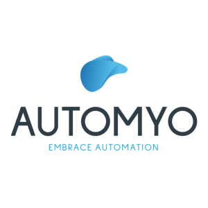
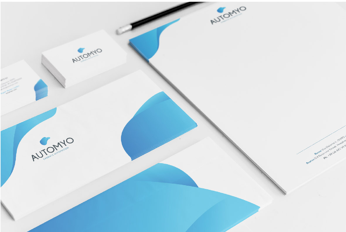
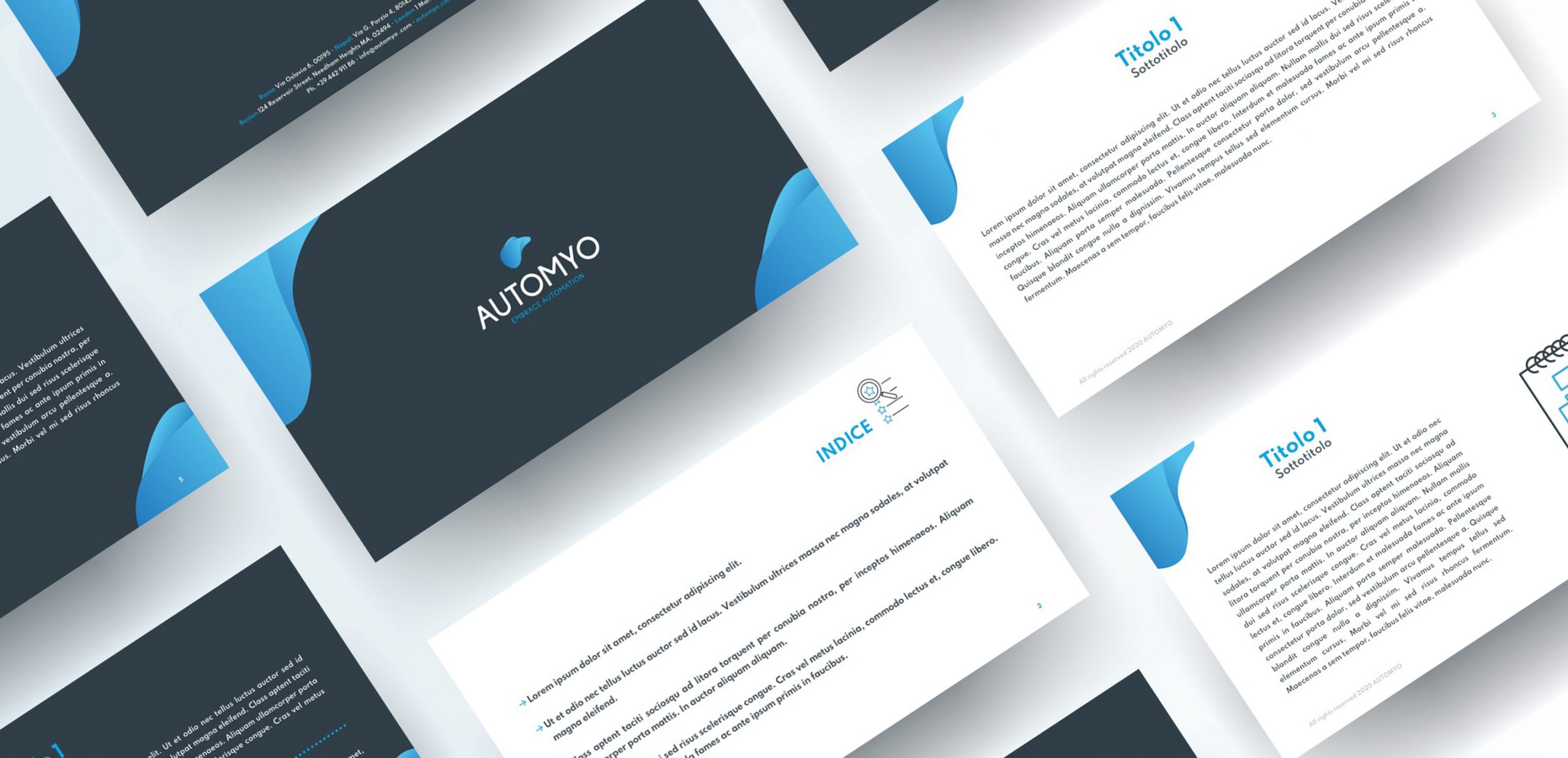
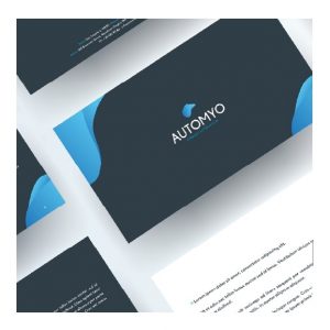
Our solution comes from the necessity to design a dynamic logo, in constant evolution. We wanted to leave a distinctive graphic sign to give the idea of a flowing and innovative company that makes automation accessible, safe, and simple. And it was accessibility, safety, simplicity and fluency the exact keywords we focused on at the design stage.

We conceived the payoff to communicate the feeling of spontaneity, simplicity and safety the user lives when making use of the solution AUTOMYO provides for the automation of company processes.

The logo, then, is enshrined in an irregular, soft and dynamic shape, constantly moving. An effect given also by the delicate slopes and the distinctive sinuosity of the strokes.

BRAND IDENTITY

  • Logo
  • Colors
  • Font
  • Payoff
  • Business cards
  • Letterhead
  • Presentation template
  • Creative package for social channels
  • Brand identity manual

FONTS

A modern, tense and stiff font counterbalances the soft lines of the logo, highlighting its fluency.

COLOURS

For this kind of branding we considered different options based on pastel colours to convey the idea of youth, of a novelty that shakes up the old status quo. Among the different options, the client chose a palette that ranged between blue and light blue, tones much appreciated by the Information Technology industry the customer works in.

CORPORATE WEBSITE

The strong competition of the field – and the high complexity of the market – required us to think of a straightforward website, yet rich in contents. This was a deal breaker compared to many competitors. The website presents several communication grounds, with multiple CTAs for different and specific targets.

Among the customer’s requirements we also noticed the necessity to structure different landing pages each with a diverse message, to support the promotion activities, especially for ongoing social and offline campaigns.

Details:

  • Multiple pages;
  • CMS: WordPress;
  • Responsiveness.

Activities:

  • Development of the website structure;
  • Content creation (text and images);
  • SEO optimization for Google positioning;
  • Installation and configuration of Marketing tools (tracking codes, DEMs, CRM integration).

NEED TO REFRESH YOUR BRAND IDENTITY?

Share This Project